 |
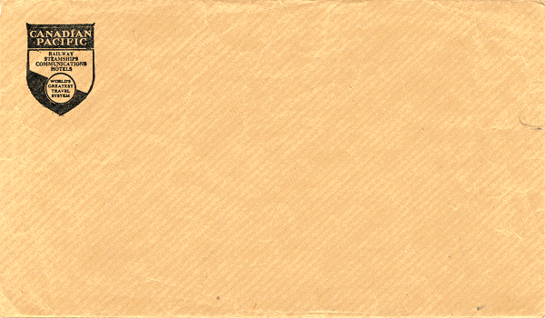
This corporate logo first appeared in 1929 when the
company's expansion called for a new look. The shield survived, but the beaver went. "Canadian Pacific"
occupied the top of the crest, leaving room below for the symbol of the company's different interests - a hotel crest,
a ship, a truck, a telegraph pole, and for the railway, its new slogan, "World's Greatest Travel System". A
simple black ink logo was used on small plain brown envelopes that were 6 x 3 1/2 inches ( 15.25 x 9 cm ) in
size.
|
|