Vol. 18 No. 7
July/August, 1988
|
Make Tomorrow Happen
|
Eighty Years of Posters Chronicle Growth of Company and a
Nation
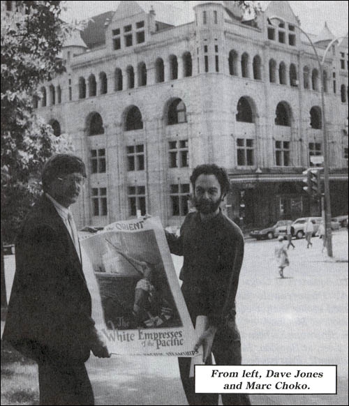
By Dave Jones and Marc
Choko
The kids' bedrooms are plastered with them -
Jackson and Jagger, The Beatles and Bowie. Pop music posters are big business. But posters are more than just
enlarged photographs of famous stars.
In years gone by, they were a very popular medium for selling one's merchandise and services. Their style reflects
the mood of a young and growing nation. And although they were not considered art in their day, they are today.
Generally speaking, Canada's role in the development of poster art has been unjustly ignored, even within the
country's own artistic community.
In 1962, for example, Paul Arthur, then managing editor of Canadian Art in Ottawa, who contributed the Canadian
chapter to Who's Who in Graphic Art claimed that:
"Prior to the Second World War, Canada was not able to support - or more accurately, had no need for - a fully
developed graphic arts industry. Graphic design was hardly known before the Art Directors' Club of Toronto was
founded in 1948".
Because commercial art often has been denigrated by art historians, few efforts have been made to maintain records
in this field, and consequently poster art in Canada has been difficult to research and document.
In fact, many of the practitioners themselves have down played this part of their work, in favour of other artistic
endeavors.
It was only recently that researchers such as Robert Stacey, Theo Dimson, Raymond Vezina, and Marc Choko have
started to uncover a rich heritage of Canadian commercial art - a tremendous production for a relatively small
market - that had nearly been lost to the country's collective consciousness; and mention often was reduced to
little more than a few lines in available reference books.
The omission is stranger still when one considers that the posters of Canadian Pacific, alone, constitute one of the
largest productions of their type that have come to light around the world.
The company's successful use of the poster through a period of 80 years, and its innovations in
silk-screen production techniques over a 20-year period, made Canadian Pacific's
contribution to the history of the medium not only an important one but an essential one.
While construction of the railway was still under way, use of the large format colour poster in advertising was
spreading from Europe to North America, and Canadian Pacific, under the guiding hand of William Van Horne - as
general manager, vice-president, and finally president - was quick to avail itself of this new medium.
Aware of the need for traffic over the newly-built line, Van Horne himself took control of the
advertising campaign and devised the imaginative slogans that heralded the advent of transcontinental passenger
operations on the Canadian Pacific Railway.
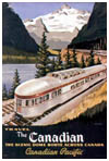
From modest beginnings in the production of posters, Canadian Pacific went on to become one of the innovators in the
field of poster design and printing, while the company was growing to become "The World's Greatest Travel
System".
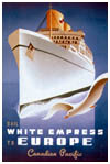
Before the First World War, the company's posters were either letter-pressed or lithographed in Canada,
the United States, and Great Britain. Most of this production is anonymous, with only the printers names appearing
on the work.
During the late 1920s and the early 1930s, some of the most famous British designers were commissioned to crate the
company's poster art.
Names such as Alfred C. Leighton, Kenneth Shoesmith, and Tom Purvis helped to bring this production to the attention
of the well-established and influential graphic art magazines of the time such as "Modern
Publicity", often illustrating their articles with Canadian Pacific designs.
The study, "Technique of the Poster", written by Leonard Richmond in 1933, not only featured a chapter on
Canadian Pacific's work in the field, but included several of the company's posters in black and white and in
colour.
At the same time, a smaller production of posters originated on the continent, in a number of languages. While the
quality of the lithography is good, little is known about the artists or the printers.
In Canada, the most important phase of poster production began in the 1930s when a printing shop was established at
Windsor Station in Montreal, following many years of anonymous lithographic poster production.
Under the auspices of the exhibits branch of the company's department of immigration and colonization, a
fully-equipped silk-screen studio was set up, with Ernest Scroggie as art director, and
James Ridge as head of the workshop.
The decision to turn to silk-screening, or serigraphy, for the majority of posters produced after the
1930s, was based on practical considerations.
The technique did not require any expensive or sophisticated pieces of equipment or supplies. It was a fast process
from the conception of the design to final production (preparation is minimal), and modifications to the design or
the text were easily introduced at any stage of the process with little extra cost.
Unlike lithography, no fragile limestone, expensive metal plates, or delicate presses were required. All that was
needed were a few frames mounted with silk, some type of resin to block off areas on the screens, paint, an
applicator (usually referred to as a squeegee) and some paper.
The silk-screen printing technique was derived from the stencil technique. The basic principle involved
stretching a piece of finely-meshed silk upon which a design had been rendered, onto a wooden frame.
One screen was thus required for each colour to be applied to the final design, leaving the areas to be painted that
colour open, while the rest of the design was blocked off with resin. By overlapping some of the colours, additional
shades could be achieved.
Each frame, in turn, was attached to a base with hinges, ensuring that the successive colours were applied in
exactly the right location on the final poster. Colour was poured onto the screen at one side and, by means of a
squeegee, was applied evenly across the surface.
In this manner, hundreds of impressions could be made in a relatively short period of time, and modifications were
done easily in mid-production by the removal of a screen, the replacement of a screen, or the
introduction of a new screen.
Blocking of the screens could be achieved by hand or through a photographic process, thus allowing for a mixture of
techniques and photomontage.
The first Canadian Pacific posters were printed with a heavy oil paint process in runs of about 25 copies. Original
designs as well as adaptations from lithographic posters were used. This technique was abandoned rapidly, in favour
of lighter textured paints.
These were obtained through airbrushing parts of the posters, or introducing more colour on one side of the
squeegee than the other.
In 1940, the poster runs were averaging approximately 650 copies, and often were printed in six colours or more. The
serigraphic process was fully adapted to the needs of the company, allowing runs of limited issue, or alternate
texts for rate and destination changes.
The graphic designers commissioned to create the poster designs were mainly local free-lance commercial
artists supplementing their other artistic endeavors. Artists such as Tom Hall, James Crockart, and Norman Fraser
were the most productive of the 1930s. Roger Couillard, Peter Ewart, and many others joined them later.
By the mid-1950s, the exhibits branch was under the jurisdiction of the publicity department (now
corporate communications and public affairs).
The expansion of the use of offset lithography slowed down the production of serigraphic posters, and many designs
were once again handed to outside printers. This was particularly significant in the case of the posters produced
for Canadian Pacific Airlines, where most of the production was handled by printers in Vancouver.
Canadian Pacific's silk-screen studio remained active during the 1960s, and was not closed down
entirely until 1972. During the period between 1883 and 1963, the company turned out more than 2,500 posters,
including more than 1,000 of its own designs, a production that may well be unrivalled.
This Canadian Pacific
Railway News article is copyright 1988 by the Canadian Pacific Railway and is reprinted here
with their permission. All photographs, logos, and trademarks are the property of the Canadian Pacific Railway
Company.
|
|