The animated semaphore OKthePK title has been replaced by this title and lantern. To have the semaphore logo displayed on top of the daily news photo required the the photo to be displayed as a background image. The semaphore then appeared on top of the photo. This required a call to the .css code file which, apparently, isn't updated at the same time as the calling page on the host's server. Hence, the photo was slow to update causing me much annoyance most days. This new lantern header solves that problem and incidentally reduces the work of updating an additional news page.

The sitemap page Article Archive list has been ordered alphabetically rather than by date.
The Archive index page has been modified by sorting the articles alphabetically rather than in the order they were published. Click on an alphabet letter to jump down to that section of the index. Older articles will not display properly on small screens. The best monitor resolution to use is 2560 x 1440 pixels.

Delete the 13 Oct 2022 lantern title logo and replace it with the animated semaphore title.

The Today page which included the website logo, lantern, and OKthepK title on the right side of the page was causing an annoying left and right movement when appearing on smartphones. The current title eliminates this problem, however, there is no longer a direct link to the page explaining the meaning of OKthePK, nor is there a popUp arrow pointing to the left side menu. Any complaints? Probably not...

Updated the About page by adding images of the old Cordova Bay Station website, the Canadian Pacific Set-off Siding website, and the old smartphone plus today's smartphone image to the history section.
One more time. Just a minor change so everything fits on a cellphone screen.
Goodbye old hamburger menu, it was a short life at only 4-months-old. It appears that Apple's software doesn't recognize the hover method on a button object therefore it requires either a mouse click or tap on their tablets and smartphones. So here you go... just for you Apple users... a menu button to tap on. Now you can see what you've been missing !
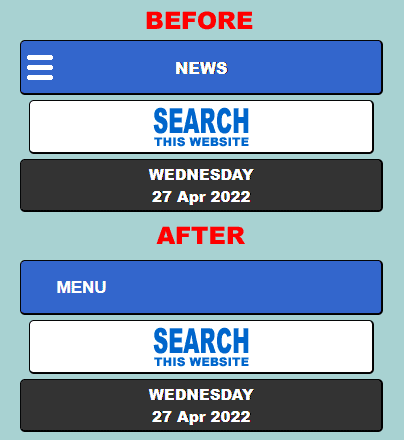
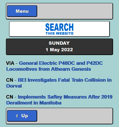
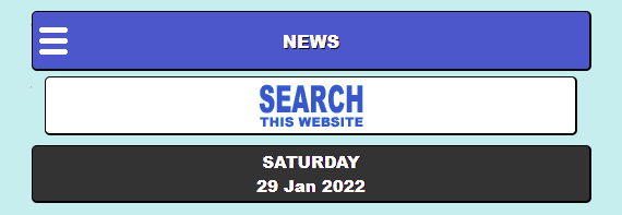
Added a hamburger menu icon to the top left corner of the home page, shorten the name to "NEWS", re-label the search button, change the background colour to a light blue, and repeat this on the World News page.
Added the accumulated Android smartphone wallpaper images to the wallpaper archive page with a popup box, named Wallpaper Junction, whereby one selects whether they wish to see the archived desktop wallpapers or the archived smartphone wallpapers.
Added an Android smartphone wallpaper image section to the Wallpaper page which will be updated each month along with each month's new wallpaper.
Added the clicking sound of a telegraph sounder to the telegram page which starts each time the page is opened.
Created a sitemap showing the structure and contents of the website. The main menu sitemap link opens an independent window that has only one instance no matter the number of times the sitemap link is clicked.
Located a program that produces Android applications and using it created an OKthePK app for smartphones after several iterations. It functions OK except the fonts are displayed too large. Contact with AppCreator24.com couldn't solve the problem as of this date.

Revised the home page header to show the daily headline photograph as a background with the OKthePK logo and lantern to the left with a blue and white lined OKthePK text on the right so that the header still displays correctly on a 640 pixel wide screen. Tossed out the World News header as it wasn't really necessary.

The OKthePK headers on the home page and World News pages have been revised and now include a railway lantern. Clicking on the lamp displays the Daily Operating Bulletin which contains notices that may be of interest to readers. The old home page header used to contain a link to a website introduction. Those pages have been deleted. Clicking on the website's address on the new header (shown below) will display the website's About page. The new header has been designed to fit on screen sized from a cellphone to a desktop monitor.

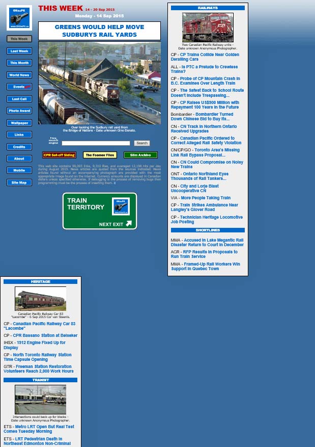
It took three days to revise the Archive index page so that it fits on screen sizes 640 pixels wide and larger. The list of articles includes an image banner for each article. There are 93 railway articles as of this date.
The spammers who misuse the telegram form are now listed on the blacklist page .
.
Since the addition of a contact form to this website the spammers and marketers just won't quit using it. Most of the unsolicited and unwanted spam sent from the contact form originates on either the GMAIL or OUTLOOK eMail applications. Therefore... these two sites are now blocked to all senders using the form. If you have an APPLICABLE message relating to locomotives, trains, railways, railfans, or this website, you'll have to send it from a different address. If you are a marketer or spammer selling or sending your garbage by lying or cheating the contact form you will receive the message below and be blocked from all further contact. Get another job and stop wasting people's time. Enough ranting...

Added a website contact form last week for the second time, so hopefully it won't be abused like the first time. If you're selling a product or service, leave me a message, I'll get back to you just as soon as hell freezes over. Souped up the form yesterday to make it kool !!!

Replace the footer on all pages so that javascript is no longer required to create the popUp.

Enlarge the size of the photos in the left column of the World News page and move the caption links below each photo.
Moving on... one more change to that exception, the clickable icon on the page footer declaring the use of W3C css and html. It's now smaller and still pops up, but it's no longer a Microsoft Window's window. This version is more efficient.

The popUp Windows are gone, vanished, kaputt, deceased, no more, just like Monty Python's parrot, except one, the .css/html link at the bottom of each page. Instead, appropriate subject matter now appears right here in this right hand column along with the news pages, etc. Next... who knows?

Delete the "Search" link from the home page and world news page drop-down menus adding a "SEARCH THIS SITE" banner to the home page top left column. Make the search page text responsive to screen size. If the screen width is 1370 pixels or greater, set the font size to 24 pixels. If the screen width is 650 pixels or less, set the font size to 14 pixels.

Modified the introduction pages by adding prior and next arrows on each side of every page. Also added a page count to each browser image, i.e. 1 of 7, 2 of 7, etc. The W3C learn more popUp now links to the About page when selected.
The left column background has been removed, the "Up to Top" link at the bottom of the page is now full width and reads "TO TOP OF LIST". With these changes the website now displays nearly perfectly on 5 browsers, Chrome, FireFox, Edge, Opera, and Internet Explorer.

Changed the footer image to be more relevant, a symbol of a smartphone, tablet, desktop, and laptop computers with the W3C, CSS, and HTML5 logos. Clicking on the image pops up a message the page was composed using CSS and HTML5 with a link to the OKthePK home page.
Discovered the search page was nearly unworkable when using the FreeFind search website as there was no way to get back to the initial search without starting a completely new search over again. ANNOYING ! So the search results are now on a separate browser tab. Should have known better.
Added some OKthePK introduction pages linked from the "Today" header explaining how the website is divided into two columns in the browser and pointed out the links to all the websites reachable from the drop down menu.

The website continues to evolve. The day dividers in the left column are no longer an uplink to the top of the column. An "Up to Top" button at the bottom now serves that purpose. Since the result was a reduction in the area scrollable the OKthePK logo, Archive logo, and the search field at the top of the column were removed to permit more space for the news article titles to scroll. A new header now appears at the top of the right hand column above the lead article. The colour of the sub titles and uplinks have been reversed.
![]() Replace the sub title triangle "To Top of Page" link icon with responsive mouseover icons. The blue colour turns orange when the mouse pointer moves over the button.
Replace the sub title triangle "To Top of Page" link icon with responsive mouseover icons. The blue colour turns orange when the mouse pointer moves over the button.
Added an updated World Wide Web Consortium (W3C) Cascading Style Sheets logo to all the website pages.

Well, it's 2 days later, and the smartphone problem still out smarts me due to the way a frame is handled by the .css code. Rebuilt the code again and we'll see what happens this time. If I had access to an iPhone trouble shooting the website design would be a lot simpler!
Forced to make a complete redesign of the website code because it would not display properly on smartphones. The CPR Set-off Siding and Foamer Files logos were eliminated so the page would display correctly when shrunk to the smallest size.
Added code to display a pertinent image when the mouse pointer passes over a specific image or text hyperlink in an effort to highlight the result of the user's mouse click at that point on the screen. Removed responsive text code as it does not function within a frame.

Made some minor adjustments with the header on the left column including a newspaper background. The logos that link to the three other OKthePK websites, CPR Set-off Siding, Railway Article Archive, and the Foamer Files, are now spaced across the top of the column and are responsive to the size of the browser window.
If you are using Microsoft Windows operating system, their old and out-of-date Internet Explorer browser cannot handle the latest web pages correctly. Your only option to view this website, as it is meant to be seen, is to switch to Microsoft's latest browser, Edge. Or... you could download and install Google's Chrome, FireFox, or Opera browsers. Any of these browsers are up-to-date, thereby supporting the Worldwide Web Consortium (W3C) standards, so they display the website properly. If you are using Apple's Safari browser on an Apple product read on. The Apple Safari web browser for Windows 8 was last updated seven-years-ago and NEVER updated to work with Windows 10. Consequently OKthePK website will not display properly in the Safari browser. If Apple users wish to view this website then your only option is to download and install either the Google Chrome, FireFox, or Opera browsers. Others may be problematical. My apologies, but times, they keep a changing.

Over the years as more devices with varying screen sizes became available this website has attempted to display properly on most devices. As you may appreciate this is a difficult, if not impossible task, due to the varying number of internet browsers available on smartphones, tablets, and desktop computers. With the advent of the World Wide Consortium's (W3C) HTML5, and CSS, cross browser designing became less difficult.
Browser popularity statistics for various browsers displaying this website (and this website only) are as follows: Google Chrome 50.3 percent, Apple Safari 23.6 percent, FireFox 13.7 percent, Microsoft Internet Explorer (MSIE) 0.7 percent, and Opera 0 percent. You'll note that Microsoft's Edge browser is not used by anyone accessing this site. The low percentage of MSIE users influenced the decision to abandon support for MSIE. So... as it was expected, the latest version of this website displays as expected with Chrome, FireFox, Edge, and Opera.
But Apple's Safari browser is now a problem as it represents 23.6 percent of the visits to the website where the intent is to reach as many popular browsers as possible. During a test of an Apple tablet it was discovered the right side of a screen display would not scroll. This MAY be due to Apple's failure to comply with W3C standards. If you encounter this problem the following MAY resolve the problem: Activate the Develop menu in Safari, navigate to the Safari menu bar, click Safari, Preferences, and choose the Advanced tab. Check the box to enable the Develop menu. Click on the new Develop menu in the Safari menu bar and select User Agent, Mobile Safari 3.2.2 - iPad.
The visitor feedback page is no longer available due to constant abuse by Monkey Digital.
A MAJOR website revision went online on this date. A separate page for Canadian news on smartphones is discontinued as the website now responds to screen sizes between 640 and 1,900 pixels.
1920 pixels wide.


Sorry people... but the Tablet page is gonzo, kaput, deceased, no more. Only 3.1 percent of visitors to the website are using the Tablet page so to lower the workload it was decided to remove it.
P.S. The survey page was also taken down some time ago while the Feedback page is currently offline due to abuse by an individual. What's next... who knows?
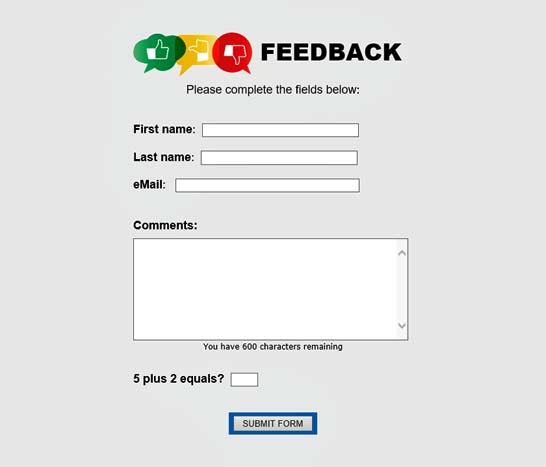
Removed the "Rate This Website" page but added a feedback page with a form containing client side field validation connected to a server side CGI script. An additional javascript indicates to the user the number of characters remaining to them and they complete the comments field.
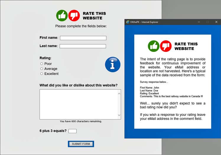
Added a "Rate This Website" page with a form containing client side field validation connected to a server side CGI script. Clicking on the round blue information button activates a javascript pop-up window explaining the intent of the rating page advising no eMail or user locations are being harvested. An additional javascript indicates to the user the number of characters remaining to them and they complete the comments field.
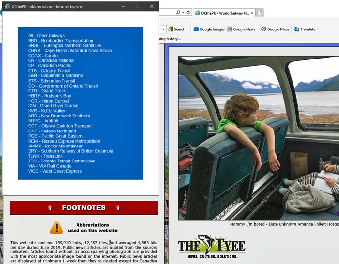
Added a pop-up window containing a list of railway and transit organization abbreviations normally used on the website loosely based on their reporting mark.
This minor revision removes the up and down arrow buttons from each day's section title. Clicking on the day of the week causes the page to jump to the top and the current day of the week. The font is prettier too!
The upper and lower menu has been removed from the tablet page.
Only today's and yesterday's news articles may be opened from the tablet page.
The height of the news article window has been altered to fit the full height of the monitor screen.
The master menu that appeared along the top of the pages was removed today for clarity.

Changed the World News page to resemble the Home Page with a list of articles on the left and the selected article displaying in a window to to the right.
Revised the Tablet menu and notes at the bottom of the page.
In addition to Canadian railway news for smartphones there is now a separate section for tablets which may be accessed from the OKthePK logo drop down menu. This should permit viewing of Canadian news on tablets that are only 1024 pixels wide.
The list of news article headlines on the left of the Home Page is now sectioned into days of the week instead of categories.
Added a master menu to all appropriate pages and provided up and down links between sections of the news article list plus several unobtrusive and unnoticeable changes.
Here we got again... the website keeps evolving. The Home Page is now only two columns wide. Links to newspaper articles are in the left column while the actual article will appear in the right hand column. Unfortunately this means the photos and images will be smaller but on the plus side everything should now fit on a 1366 x 768 pixel size monitor without having to adjust your zoom. Compromises, compromises...
Can't make up my mind... the last two footers just didn't seem proper somehow.

Revised the home page footer... again.

Revised the home page footer.

Added a master menu to the top of the home page.

My apologies to readers but all that work building the website to display on desktop computers, tablet computers, and smartphones is now out the window. Maintaining all the pages was just too time consuming and onerous. As of this date there is only one size for the entire website of 1920 pixels wide. Daily news at 300 pixels wide will still be available for smartphones however.
Revised the website's main index page to display more data and spruce up its look.


A newly created website was uploaded on this date. Unfortunately, I rushed the publication with the result being far too many bugs and bad links appearing. Five days later and things seem to be sorted out. The intention of this revision is to provide three versions of the website for display on either a desktop computer, tablet computer, or a smartphone. There was a lot of background work invisible to the reader such as creating new cascading style sheets and re-building folders but for the website reader the most dramatic change will be the initial opening of a tunnel page with buttons where they must choose on which device they wish to display the website, DESKTOP, TABLET, or PHONE. A reader can avoid this page later by setting a bookmark in their browser once they make their initial selection. The next website update should possibly consider adding code that would automatically determine which device a reader is using then take them directly to the appropriate website pages for their device. We will see...
The main pages have been reduced in width to better fit on tablet computers.
The menu names have changed slightly with the order also revised. The Synopsis page is discontinued. Daily Canadian news once again includes more than one article. The Last Week page has been discontinued as that news appears on the Canada page. The Wallpaper Archive pages now display the current background.
The W3C CSS validator is now disallowing the margin:left; property. Replaced it on all current pages with margin-left:0px;.
Added a "Back" button at the top left side of the news pages.
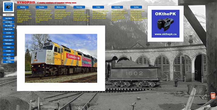
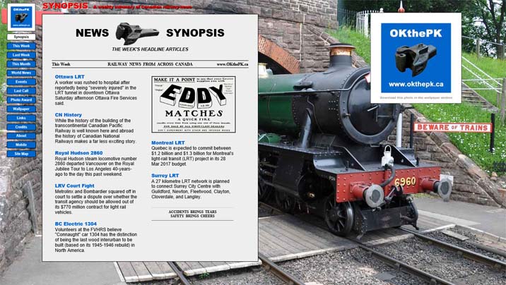
There are two revisions on this date. Firstly, the old Synopsis page, the third image below, has been revised to include a slide show displaying a photo from the lead article for each day of the week. Clicking on a day-of-the-week button at the top of the page, or on an image, brings up the news article for that particular day. Secondly, the OKthePK Homepage has been altered to include a slide show of the weekly news articles. Click on an image to read the news article.
Some time ago I started using several Dublin Core meta tags. This required a link relationship meta tag linking to their website. Well... the buggers changed their address so now I have hundreds of pages containing that Dublin Core meta tag. Rename or remove? Guess what... no more Dublin Core!
Removed click sound from menu.
OKthePK logo modified slightly.
HTML5 start tag modified to <html lang="en"> as per W3C specifications.
Major changes have been made across all pages although little will be noticed by the frequent reader. The main menu buttons are now fixed in place on the left side of the screen and also sound a low beep when the mouse pointer touches them. If you don't hear that sound then your browser doesn't support the HTML 5 audio element. Currently, Microsoft Internet Explorer, Microsoft Edge, FireFox, Opera, and Google Chrome support HTML 5 although Opera and Chrome are still not completely compatible with HTML 5 as they have some special issues.
Link to auction page removed as auctions have ceased.
Added links to a Synopsis page.
Does your screen look like this?
OKthePK web site is designed to look best at a screen resolution of 1920 x 1080 pixels. But it is designed for a MINIMUM screen width of 1,366 pixels. If you reduce your browser width to less than 1,366 pixels the rightmost column will move below and to the left as shown above. Continue reducing the browser width and the next column will follow... etc. and etc. until only the menu buttons remain with all else below them. Try it... switch to the home page then drag the right hand browser window border to the left. So... if you're using a smaller screen size, say 1024 x 768, then the rightmost column will appear as above. Statistics show the most common screen size is now at 1366 x 768 pixels. If you're still using 1024 x 768... Sorry. But... you can make the home page fit your screen by setting the browser's zoom function to 75%.
Still more nested tables removed from pages for faster load time. Site map page changed to standard page format.
More nested tables removed from pages for faster load time. With HTML5 the best practice seems to be to use as few tables as possible.
Remove tables from news and mobile pages to increase download speed. From this date forward the up and back buttons on the news pages will move beneath the article content onto the background. Fair Dealing footer added to the news pages.
More nested tables were removed to speed up browser loading even more.
Using nested tables on a web page increases the download time because the browser has to do additional calculations loading the nested tables. To speed up downloading most nested tables here were removed.

Reduce all pages from a maximum size of 1920 pixels wide to 1330 pixels wide.
Dropped modified news pages designed for viewing on laptop computers.
Changed the page title format and header for the lead news article:

Just when you get comfortable with the web site I go and make another annoying change. Why? The idea behind the new design is that when the Home Page opens all the railway news links are readable without scrolling. A reader still has to scroll down while reading each individual news article and other pages. It is either this or scroll sideways to read, not a better choice. All the previous screen designs required a minimum of 1024 x 768 pixels but this new design requires 1920 x 1080 pixels to be viewed properly. The new design is based on the assumption most computer owners now own larger screens so this change shouldn't be a problem... hopefully. Internet Explorer, FireFox, and Opera browsers have a zoom feature that will change the viewing area if that helps. Use the menu buttons on the left side of the screen to navigate around the web site. Below this paragraph you'll find screen captures of the new and old designs followed by all the revisions since 2011 when this page was commenced:


Modified the Home page header somewhat.

Added a Special Events page to the web site.
Corrected the web site background to display properly in monitors with a width of 3840 pixels or less.
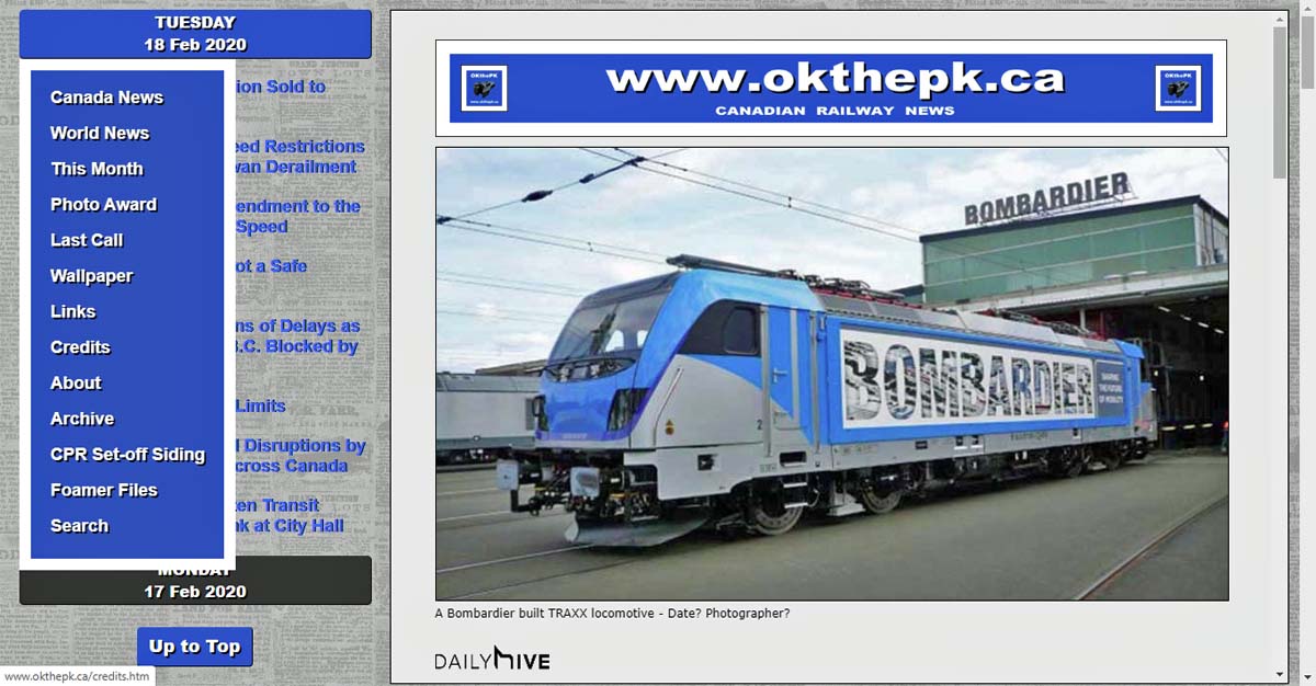
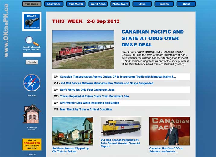
The news article of the day now contains a large photo applicable to the article headline such as this:
updated every Monday
Today's Headline - Thursday - 10 Apr 2014

A daily external link to the news story of the day is now provided at the top of the Home page as follows:
For today's news story click on this external link:
CP - Holiday Train Rolling Into Town.
OK, here we go again, another damn change! You readers out there don't appreciate the amount of time required to prepare this web site for publication each week. This was the reason for discontinuing the news pages for smartphones some time ago. It simply took too long to prepare two sets of pages, one for large screens, and the other for mobile phones. But... I think I've found a way to have my cake and eat it too. So now the mobile pages will return. But... (Compromise, compromise, such is life.) because of this change the Home page layout has changed. Not as pretty now but more functional, and boring, compromise, compromise.
A News Flash section was added to the Home Page today. This section will appear at the top of the Home Page when appropriate as breaking news happens. Click on the banner or the news headline to read the article.


The Windows 8.1 upgrade was released today so I upgraded my operating system by downloading and installing it in about an hour and a half. The return of the old Start button is a joke. It doesn't bring back the programs menu as before. It should now be called the Tile button as all it does is bring up the tiles screen. The install set-up menu forces you to log onto a Microsoft account before continuing. Your original password being replaced by the logon password you provide. It took some time to figure out how to restore the original password which is now called a "local" password. Previously installed anti-virus software, Avast, doesn't function in Windows 8.1 so a dialog box indicated where to go for an upgrade. However, if you select a Microsoft account during the Win 8.1 install versus a local password this seems to interfere with Avast. After several un-installs and re-installs of Avast 2014 the program still failed. A Windows update downloaded 3 additional files not included with the 8.1 upgrade which included a patch for Avast. Avast now appears to be functional even though the browser's Manage Add-ons menu says it is incompatible. Go figure! HTML 5 files in Microsoft's Internet Explorer seem to appear the same as before but several browser add-ons are now marked "incompatible" and don't function. There is no way to remove incompatible add-ons by using the browser's Manage Add-ons menu. Also, the browser tends to lock up more frequently since the 8.1 update so it must frequently be killed with the Task Manager then restarted. Next problem...
Although not particularly apparent the web site underwent a fairly major revision making most of the web pages more uniform with a standardized blue gradient background. Logos and images with links now appear on the left side of most pages, with a couple of exceptions. The layout of the THIS WEEK and NEXT WEEK news pages is somewhat simplified. Next? Wait for it...
Shrunk the page headers slightly and changed from white to blue for no particular reason.
I've had a request to increase the size of the small photos on the home page, (the "This Week" page). I've done that, but it's a trade-off, just like everything in life, compromise, compromise. By increasing the photo size that also increases the page load time. The solution was to decrease the number of small photos to keep the load time short. So instead of small photos there are just text headlines in some cases. Next...
Sorry folks... but Canadian news will now be presented weekly instead of daily. OKthePK mobile news for smartphones is no longer available. I've had to cut down my work load... and try to get a life.

Here are some visitor statistics for the year 2012 collected by the OKthePK server that you may find interesting, or not...
Total number of web site hits during year = 1,942,481
Average hits per month = 161,873
Average hits per day = 5,322
Busiest month of the year = October
Busiest day of the week = Wednesday
Browsers reading this web site:
Microsoft Internet Explorer = 48%
FireFox = 18%
Apple Safari = 18%
Google Chrome = 12%
Opera = 2%
The first upload of this year includes all the recently constructed HTML 5 pages. I had missed the search results page earlier but that too is now HTML 5. The web site appears substantially the same in four browsers, Microsoft Internet Explorer, FireFox, Google Chrome, and Opera. If you're using Apple's Safari browser please advise me of any anomalies, perhaps I can correct them.

Way back when, I don't recall how many years ago, HTML (Hyper Text Mark-up Language) became popular. It was simple, easy to learn, and compact, saving bandwidth with each small file holding a web page. One of the early complaints was the difficulty in displaying where text and images appeared on a web page. This short coming was soon solved when the table tag came along providing many ways to position text and images.
Then some genius decided that the mark-up (WHAT text and images are displayed on a page) needed to be separated from the presentation (WHERE and how the text and images are displayed on a page). The resulting solution was CSS (Cascading Style Sheets).
So now simple HTML was complicated by the addition of CSS, a new language to be learned. However, even after the introduction of CSS each new version of HTML, up to 4.01, generally still had the ability to place text and images where you wanted without the use of CSS. A web page designer could avoid using CSS entirely if they chose.
Then along came HTML 5 and all that changed. In HTML5 the presentation is totally separated from mark-up so a web page designer is now forced to use CSS.
It took nearly 2 weeks but this web site is now entirely constructed with HTML 5.
I miss the good old days of simple HTML.
Below is my Reliability History chart from the Action Center which indicates some of the problems I've experienced since upgrading to Windows 8. The red dots with an X indicate critical failures of Windows 8. In some instances when there is a critical failure the "blue screen of death" appears and all current work in progress is lost as the computer shuts down. There will be no warning to save your work! The yellow triangles indicate a warning but the system seems to remain stable when that occurs. The blue dots indicate the operating system has taken some action, such as updating Windows Defender, and have no apparent effect on computer use. The chart covers the period from 14 Oct 2012 to 9 Dec 2012. The large increase in critical failures began with the installation of Windows 8 on 27 Oct 2012. Since then there has been an improvement but critical failures still occur.

This annoying Windows 8 Internet Explorer browser version 10 error message:

Is caused by an Avast anti-virus program module named WebRep. Running the Windows 8 troubleshooting program against the Internet Explorer program will find the Avast WebRep module and disable it. Microsoft Internet Explorer browser then functions normally. My apologies Microsoft, thought you were to blame for the problem. I'm still monitoring the Windows 8 reliability history with the Action Center. Critical failures are still occurring but with slightly less frequency.
Windows 8 Internet Explorer browser version 10 produces this annoying error message continuously.
The Windows 8 Action Center keeps track of system failures and produces a graph. Here's what my PC installation of Windows 8 looks like for the period 31 Oct 2012 to 18 Nov 2012. The red dots indicate critical failures.

Changed the lead story photograph on the mobile page to full screen size and moved the headline text beneath it.

ATTENTION Windows Users: DO NOT UPGRADE to Windows 8. The operating system is unstable on a PC and may crash or freeze up the computer at any time. The big blue screen of death has returned! Too bad... Windows 7 was very stable. Over time Microsoft will most likely fix these problems but waiting to upgrade would be a wise choice.

Today Microsoft Windows 8 Pro Version 6.2.9200 Build 9200 was installed and updated running Microsoft Internet Explorer 10 Version 10.0.9200.16384. OKthePK pages were specifically designed for Microsoft Internet Explorer version 10 running on the Windows 8 operating system. They will display properly at 1920 x 1080 or 1176 x 664 resolution. Other browsers, operating systems, or resolutions may be problematical. If you have a problem please contact me. Happy Halloween... Boo !
To reduce scrolling of the Home page news article photos and links are now side by side in pairs. Tightened up the header and menu spacing on each page as well.
Most noticeable change is the "Ballast" background. Text is slightly larger as Cascading Style Sheets are now employed on all pages.
Replaced the Download button link to a Wallpaper of the Month page.
Modified the CSS code to set the base font on all pages.
Rebuilt the Site Map page making it more interactive and perhaps more interesting. Added a second link from the home page to the site map marked "Explore this web site".
For consistency sake added more "Up" buttons to several pages and removed all the images from the About page. Thought the Up button was too large and distracting so reduced its size.
Changed the footer on all pages to provide an "Up" link to the top of the page and a Home page link.
Added a more effective free web site search feature by Free Find on the right side of the Home page. The old search function by FusionBot.com has been removed from the CPR Set-off Siding Latest Updates page.
Added "Up to top of page" links to Yesterday's news page. Changed link colours on all pages except Home page and Mobile pages to make them more readable. Added Canadian flag to header on all pages.
Well... it's a new year, so time for a change. It's obvious the Christmas holiday web site couldn't remain throughout the new year so there are really only four revisions to the web site. Rather than having one large photo for the lead news article all the news articles show a photo on the homepage along with their respective title. Click on either to read the article. This forced various icons and logos to move to the right side of the page. The third revision changes all page background colours from blue to grey. The fourth revision involves the mobile page. The large opening news article photo has been replaced by a smaller photo to match all the others appearing there.

Snow falling on the Christmas web site home page has accumulated on several of the hyperlinks. A Christmas tree appears to the left side of the screen while a gift marked "Do NOT open before December 25th !" will be found at the bottom of the page. Santa Claus has advised you really should wait until December 25th before clicking to open this present.

The Mobile news page was modified today. Large headline text now precedes the first photograph. Pressing on either the photo or the headline text will open the news article. Each story below the first article now includes a small photo along with the story title. Pressing the photo or the title will open the appropriate news article.

The "This Month" page was updated to match the latest changes. Added a link at the bottom of the "Home" page to this page then placed a link on the "Site Map" page to this page. Added the QR code image to the bottom of the Home page with an appropriate link. Added a link from the Site Map page to the QR code page.
Web site design rule number two, consistency. Since the menu buttons were moved to the top of the Home page yesterday they now appear in that same location on all other pages too. Also, the button colours have been reversed. Buttons now turn grey when the mouse pointer hovers over them. After clicking on a particular button upon arrival at the appropriate page the button remains grey to indicate it is inactive.


If you have visited this web site regularly perhaps you noticed the size of the photograph on the home page increased in size over time. (In the last iteration it went from 588 pixels to 640 pixels wide.)
This forced other columns on the page to become cramped. To compensate, the total width of the page then crept up to 1082 pixels.
Now, anyone who designs web pages knows there are many issues to address with the size of a readers screen being one of the most important. This brings up the question, "What size is the reader's screen?".
Over the years computer monitors have continuously changed. The analog TV tube types have been eclipsed by digital LCD monitors. Along with this evolution screen sizes have increased too (For instance, mine is 1920 x 1080 pixels.) so that there are many sizes to choose from. As a web site designer one must choose the most common size so as to satisfy the most common monitors that are out there. Therefore the size chosen as the most common today, and this is just a guess, is 1024 x 786.
So... this web site had been re-designed to fit within a 1024 x 768 screen. (You are still required to scroll up and down.)
To permit the headline story photograph to remain at 640 pixels wide the only way to accomplish this was to reduce the number of columns on the home page from 3 to 2. This necessitated moving the menu buttons to the top of the screen with the "CPR Set-off Siding", "The Foamer Files", and the "Slim Archive" buttons near the bottom. All other pages remain unchanged at this time.
Those of you running laptop computers with 1024 x 768 screens will thank me, but those with larger screens, not so much.
Compromise, compromise, life is full of compromises.